


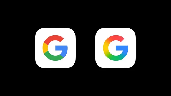
For the first time in nearly a decade, Google has given its iconic “G” logo a modern refresh. It’s replacing the solid color blocks with a smooth, continuous gradient. The updated design subtly reflects Google’s growing focus on AI.
The new look, which aligns visually with the branding of Google’s AI assistant, Gemini, shows the company leaning deeper into artificial intelligence and advanced technologies. The original “G” logo debuted in 2015, marked by distinct color segments and the then-new Product Sans font.
Currently, the gradient logo is live in the Google Search app on iOS and visible on Pixel devices. A beta version of the Google app on Android (v16.18) has also started showing the redesigned icon. However, the updated logo hasn’t yet reached non-Pixel Android phones or the desktop version of Google Search.
Google hasn’t confirmed when—or if—the new logo will roll out across its full ecosystem. Until then, users may notice a mix of the old and new icons depending on the device or app in use.